


In the world of children’s fashion, packaging and trims are more than just finishing touches; they’re powerful tools for storytelling, brand identity and consumer trust. As Head of Design at Trimco Group, Morten Frost Madsen has spent over 15 years shaping how leading children’s brands connect with both kids and parents through innovative, safe and sustainable design. In this interview, Madsen shares his insights on the unique challenges and creative opportunities in designing for young audiences, the growing importance of sustainability, and the trends set to define the future of children’s packaging.
Laura Turner: Can you tell us more about yourself and your role at Trimco?
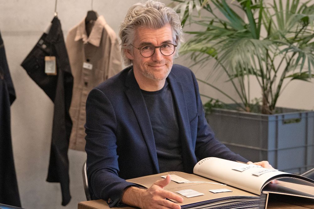
Morten Frost Madsen: I’ve had the privilege of leading the design efforts at Trimco Group for over 15 years, working alongside an incredibly talented and diverse team of 12 graphic designers and our Group Creative Director. Based in Denmark, I collaborate with a team that spans multiple nationalities and areas of expertise, from 3D design to trend forecasting. This diversity is one of our greatest strengths, allowing us to approach projects with a rich blend of perspectives and skills.
My journey began in product design, where I developed a deep appreciation for the balance of form and function. This naturally evolved into my passion for trims and packaging, where every detail matters. I draw inspiration from iconic Danish designers like Arne Jacobsen and Verner Panton, who seamlessly combined aesthetics and functionality. For me, design is about creating something that not only looks beautiful but also serves a purpose and tells a story.
LT: What are some of the unique advantages and challenges when designing labelling, brand identities and packaging for children’s brands?
MFM: Designing trims and packaging for children’s brands comes with unique opportunities for creativity but also a set of distinct challenges. One of the biggest challenges is navigating the strict regulations and safety standards that apply to children’s products. For example, trims and packaging must often comply with guidelines around non-toxic materials, choking hazards and durability. This means every design decision, from the type of ink used to the size and placement of trims, must be carefully considered to ensure compliance while still delivering on creativity and functionality.
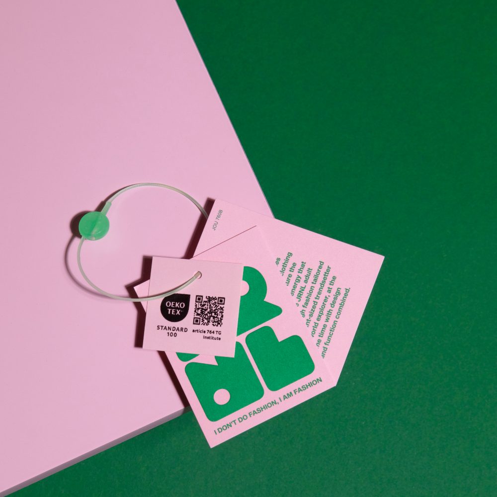
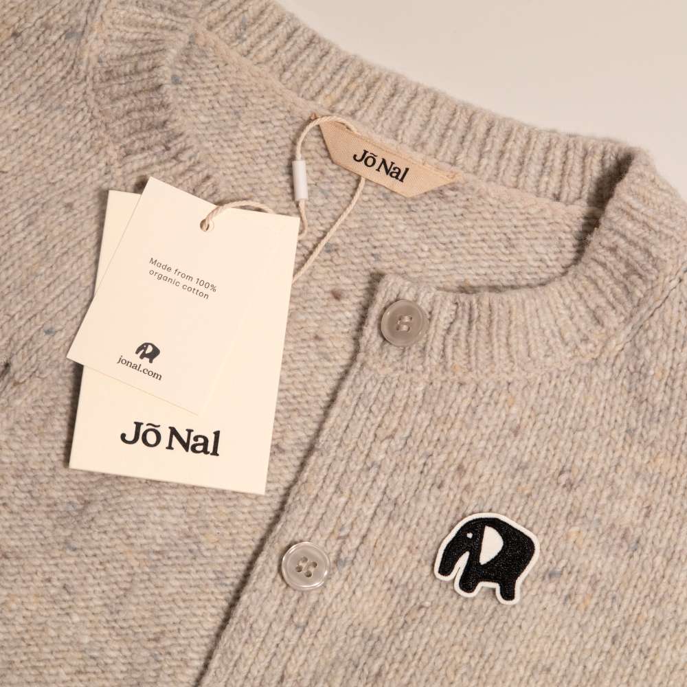
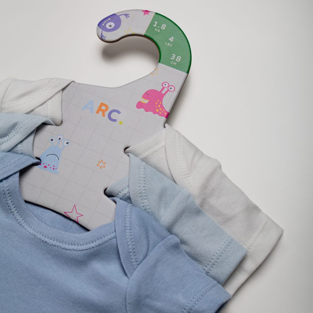
Another challenge is balancing the dual role of packaging and trims. Beyond their primary functions – protecting the product, supporting transport, and providing essential information – these elements also serve as powerful tools for storytelling, branding, and consumer engagement. For children’s products, trims and packaging often need to be interactive and engaging, sparking curiosity and playfulness in the child while reassuring parents of the product’s quality and safety. For example, a hangtag might double as a collectable card or a game piece, adding value beyond its traditional purpose.
Age-appropriateness is another key consideration. Younger children are drawn to bold colours, simple shapes, and tactile elements, while older children may prefer more sophisticated designs or interactive features like augmented reality. Packaging and trims must cater to these developmental differences while still aligning with the brand’s identity and values.
The advantage of designing for children’s brands is the creative freedom it allows. There’s room to be playful, imaginative, and even whimsical, which can make the design process incredibly rewarding. However, the challenge lies in balancing this creativity with the practical needs of parents and the strict requirements of regulations. Ultimately, the goal is to create trims and packaging that are visually appealing, functional, safe, and aligned with the values of today’s families.
LT: How do you approach designs that captivate both children and their parents?
MFM: When designing for children’s products, I always keep in mind that we’re essentially communicating to two audiences at once. Children are naturally drawn to bright colours, fun characters, and interactive features, while parents are looking for reassurance in terms of quality, safety, and brand values. The key is to find the sweet spot where these two perspectives meet.
For children, we use design elements that spark imagination – playful illustrations, bold shapes, or tactile features that invite interaction. For parents, we ensure clarity in communication, a clean and trustworthy brand expression, and packaging that feels durable and safe.
Storytelling plays a big role in bridging the two. If the design can tell a story that excites the child and at the same time conveys the brand’s reliability and values to the parent, then we’ve succeeded. Sometimes it’s as simple as designing a hangtag that doubles as a collectable or creating packaging that can be reused in play – small details that deliver emotional connections for both target groups.
In short, our approach is about creating designs that are fun and engaging for children, while giving parents confidence that they’ve made the right choice.
LT: Many of your clients, like Frugi and Viking, are known for their strong brand identities. How do you translate a brand’s values and character into your design work?
MFM: A key part of our design team’s role involves integrating new elements and trends into the designs, while preserving the identity of the brands we collaborate with. It is important to understand the unique DNA of each brand so that when we integrate newness into the designs, it enhances the brand’s expression. For example, a label for a new range should express the character and qualities of the new range, draw attention and distinguish it from other ranges within the family. However, it should still distinctly be part of its parent brand. It is about getting the balance right.
While we work with childrenswear brands, it is important to note that, even if we have the ability to do this, we only serve designs if the brands request it. Otherwise, we are working with the designs provided by the brand. In our collections, we sometimes have kids and youth capsule collections for inspiration, and this is where we usually unfold our creativity if the brands do not require it.
LT: With Christmas approaching, what trends or innovations are you seeing in the design of occasions and luxury packaging for kids’ products?
MFM: Christmas packaging for children’s products is all about creating memorable, multi-sensory experiences. One trend could be the rise of interactive packaging – designs that invite children to engage beyond the unboxing moment. For example, packaging might include perforated shapes for cutting and crafting, puzzles, or even QR codes that unlock digital stories or games. This adds value but also encourages fine motor skill development and creativity. Breakfast cereal brands have long utilised packaging space for storytelling and activities, and this concept can easily be embraced in trims and luxury packaging, giving these details a longer life.
Numbers also play a role in understanding the impact of premium packaging. For instance, 83% of US consumers say premium packaging makes a product more desirable as a gift, and 42% are more likely to share products on social media if the packaging is visually appealing. For packaging, think textured surfaces, bold colours, and playful elements that make the unboxing experience both safe, interactive, longer lasting and magical.
Another trend is storytelling through packaging. Brands are using trims and packaging to convey narratives, whether it’s a whimsical holiday tale or a message about sustainability. For children, adding humour or surprise, like hidden illustrations or playful characters, can make the experience even more engaging. But because sustainability is getting more and more attention, for parents, this type of information can be even more relevant. As parents, we want to leave our children a better planet, so informing them about relevant information that might positively affect the future would make parents appreciate a brand more than another. There are different materials that are suitable for both trims and packaging that are recycled or recyclable and can still deliver the premium feel that makes holiday packaging special.
LT: Sustainability is a growing focus in luxury packaging. How do you integrate eco-friendly solutions into premium designs for children’s brands?
MFM: Sustainability is a gigatrend across the entire sector and will only become more important over time. Shoppers are actively seeking out brands that communicate their commitment to sustainability in a clear and trustworthy manner. And part of that “trust” element is to communicate quality via premium packaging, trims and labels.
The key lies in striking a balance with playful colour use, meticulously chosen materials, and textures to infuse functionality with timeless luxury. Designers need to remain informed on the latest production and material innovations so that they can choose the best options for their clients. Many of Trimco’s ranges focus on easy recyclability with mono-material compositions, as well as repurposed and innovative materials like wool felt and cactus PU, non-toxic inks such as Algae Ink, and even plastic-free RFID inlays for RFID tags.
The other very important element is to communicate this commitment to sustainability in a clear manner on labels and trims. These once considered “throw-away” items now have a more important duty than ever before. They carry important information about the product and brand, as well as waste sorting information, circular fashion initiatives, or compliance requirements. End-users must be able to access this information easily, and that is an important consideration during the design process.
LT: From a design perspective, what advice would you offer to children’s brands when briefing for new labelling, branding or packaging projects?
MFM: My best advice is to start with clarity. A strong brief should outline not only the creative ambitions but also the practical requirements: age group, regulatory standards, sustainability targets, and desired consumer experience. The more specific a brand can be about its values and the story it wants to tell, the stronger the design outcome.
It’s also helpful when brands think about the full journey of the product: from store display to the unboxing moment at home. Packaging and trims aren’t just carriers of information; they are touchpoints that shape how both children (of a certain age) and parents perceive the brand. A clear brief that balances creativity, compliance, and sustainability gives the design team the best foundation to create solutions that please children/youth, reassure parents, and stay true to the brand’s identity.
Where possible, we also love working with complete concepts, meaning that we like to create seamless designs that are connected, from trims to product packaging, in-store packaging (holiday/occasion packaging or gift packaging), and ecommerce packaging. We believe brands’ customers appreciate a unified identity and journey for their purchases, inviting them into the world of the brand they have chosen.
LT: Looking ahead, what do you see as the key trends shaping the future of labelling and packaging design for children’s brands?
MFM: Several trends will shape the coming years. First, sustainability will continue to be the number one driver. Parents are becoming increasingly conscious of their choices, and brands will need to show commitment through recyclable materials, reduced packaging waste, and transparent communication on trims and labels.
Second, interactivity and digital integration will grow. Augmented reality, scannable codes, or packaging that transforms into a toy or collectable can extend the value of packaging beyond its first use.
Third, personalisation and storytelling will be more important. Children’s brands that can create a sense of magic and individuality – whether through playful graphics, character-driven trims, or packaging that unfolds into a narrative – will stand out.
Finally, there’s a shift toward premium simplicity: clean, well-crafted designs with tactile details that speak to both children’s imagination and parents’ trust. Less clutter, more clarity, but still with room for playfulness.
For further information on Trimco Group, please click here.